
Aktua Konstruktion
Branding and corporate identity for a sustainable architecture studio.
Role
Aktua as a newly formed bio construction and sustainable architecture studio working to change how people think about sustainability applied to construction and house design. In early 2014, they approached me to create an identity, from logotype to color palette and business cards.
Date
April 2014
The identity
The brief for new brand identity was quite quite open, which was good because it meant initial ideas and sketches could help to refine and uncover what was needed. I began working on five guiding principles we established as important characteristics of Aktua:
Sustainability-oriented, Reinventing, Transforming, Efficiency, Reinventing, and Eco-friendly.
Despite there being some nice ideas for how the logotype could change and morph to communicate change, there was a worry that most of the ideas felt a bit too technical and masculine.

We iterated on several sketches. They found interesting to merge the initial word of the studio with an abstract pine tree, which encapsulates Aktua’s main promise as a sustainable brand.
Through this process, we realized that Aktua really wanted to move away from technical, architectural shapes, in favor of more natural, soft lines. This would help differentiate them and do away with the baggage and preconceptions that companies working in bio construction are at the end of the day similar or same as non-bio friendly ones.
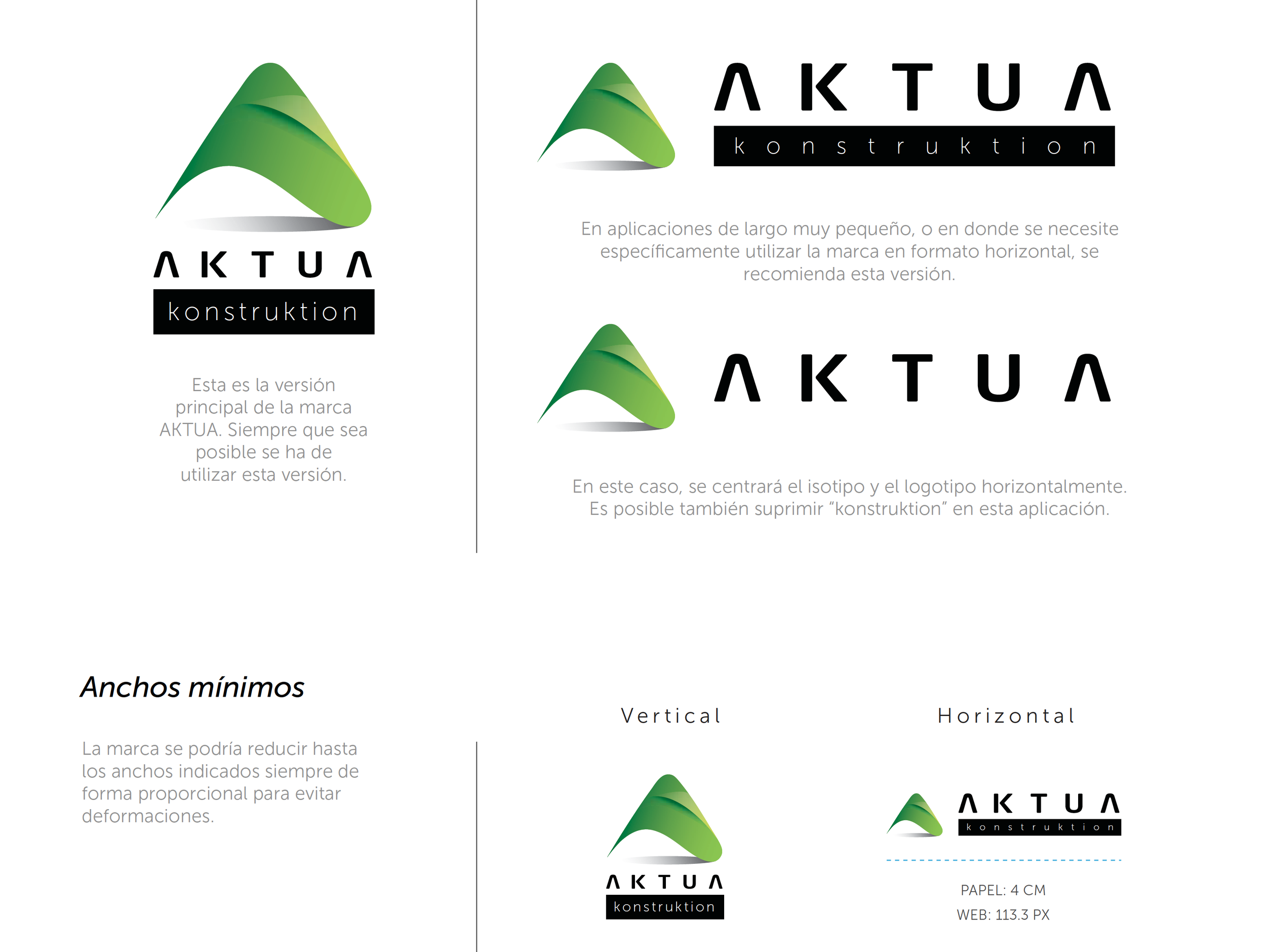
A small snapshot that depicts part of the brand identity guideline made for Aktua Konstruktion.

A stationery pack was also commissioned. Following Aktua’s principles, recycled paper was strictly used to print these deliverables.

Aktua’s business cards. It was a thing 10 years ago!

Aktua Konstruktion is still operative and based in Valencia, Spain.